Project information
- Category: Website design
- Clients: Alt Labs, Sage, The Last Dance
- Summary: A variety of website design refreshes to increase engagement.
Alt Labs
Website Redesign
Alt Labs is a North East UK innovation agency that runs design sprints and accelerator programmes for start ups in collaboration with large businesses. Their main partner is Transport for Wales Rail who they work with closely to source promising start up ideas which could help innovate the rail industry through Lab by Transport for Wales. I worked closely with Alt Labs to refresh their previous logo as part of a rebranding project and a secondary part of this work was to create an updated version of their website that better suited their service offerings.
Research
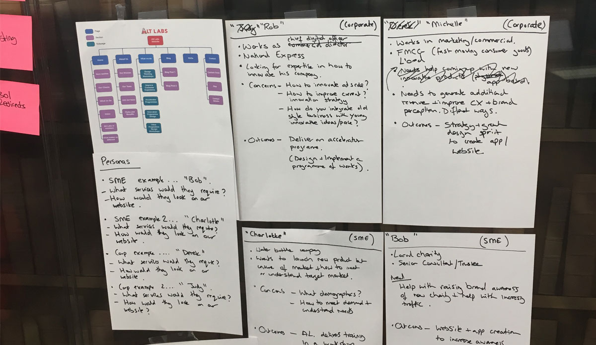
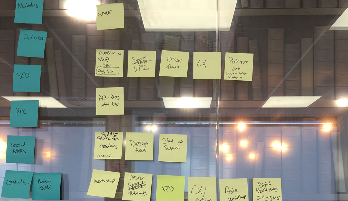
The current site map was visualised using Axure so the hierarchy of the existing data architecture could be seen at a glance. An internal stakeholder workshop was then held to identify who the business identified as the current personas so these could be validated later on through research.
Competitor analysis was performed to research what service offerings other innovation agency websites were providing as a one stop solution for small and medium sized businesses, as well as referencing their visual identities and latest trends with website components. Once this research had been presented back to the team we performed an affinity mapping exercise to brainstorm all the different offerings that would be provided and how those groupings would make logical sense.
Design
Initial low fidelity wireframes were created in Axure to map out the new information architecture and to validate internally that the team was happy with the proposed changes. Once this was signed off a high fidelity clickable prototype was created in Axure to present the visual branding refresh as well as to indicate areas which would need further input from the business.
Validation
The high fidelity protoype was shared amongst a wider internal audience for testing and to gauge feedback. Once internal stakeholders were happy the prototype was showcased to a wider audience and feedback and suggestions were gathered as a source of improvemnents. This phase of research validated whether the design layout made sense to potential small businesses and whether they would use the navigation as expected.
Sage
Careers Website Redesign
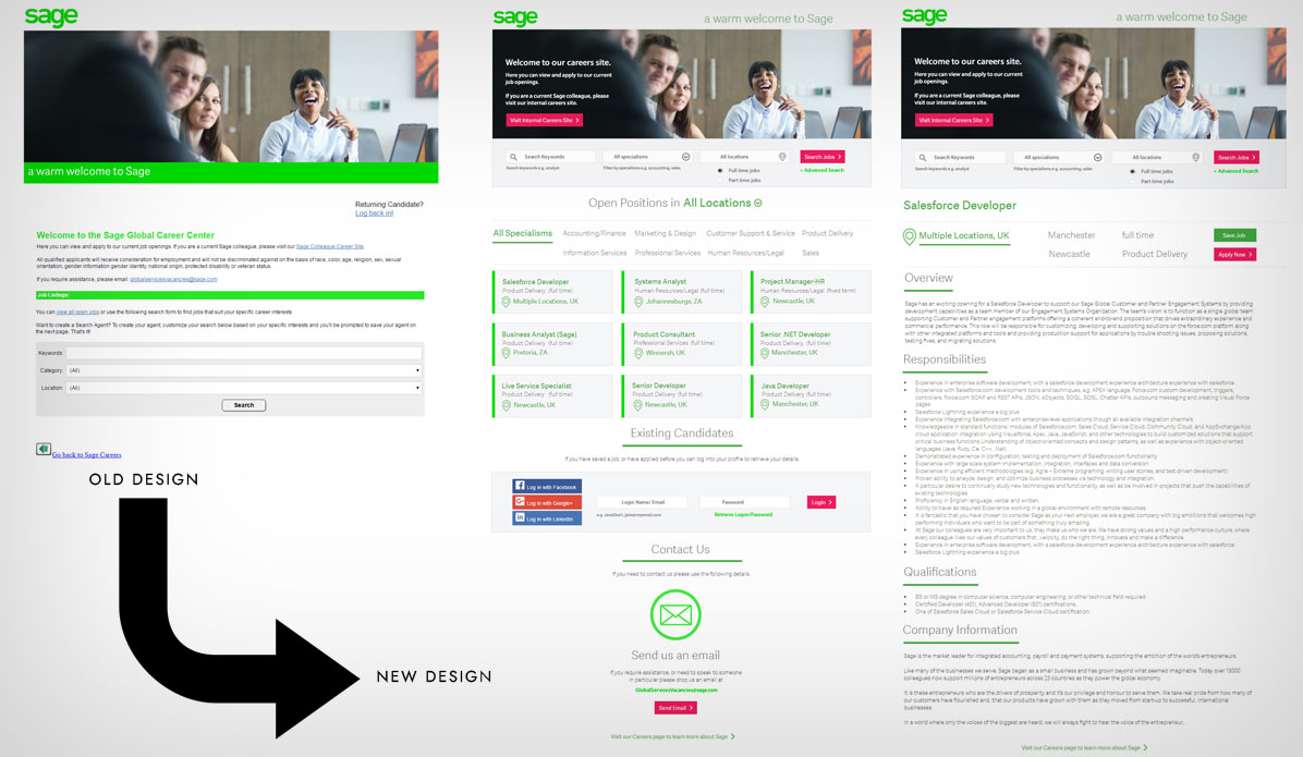
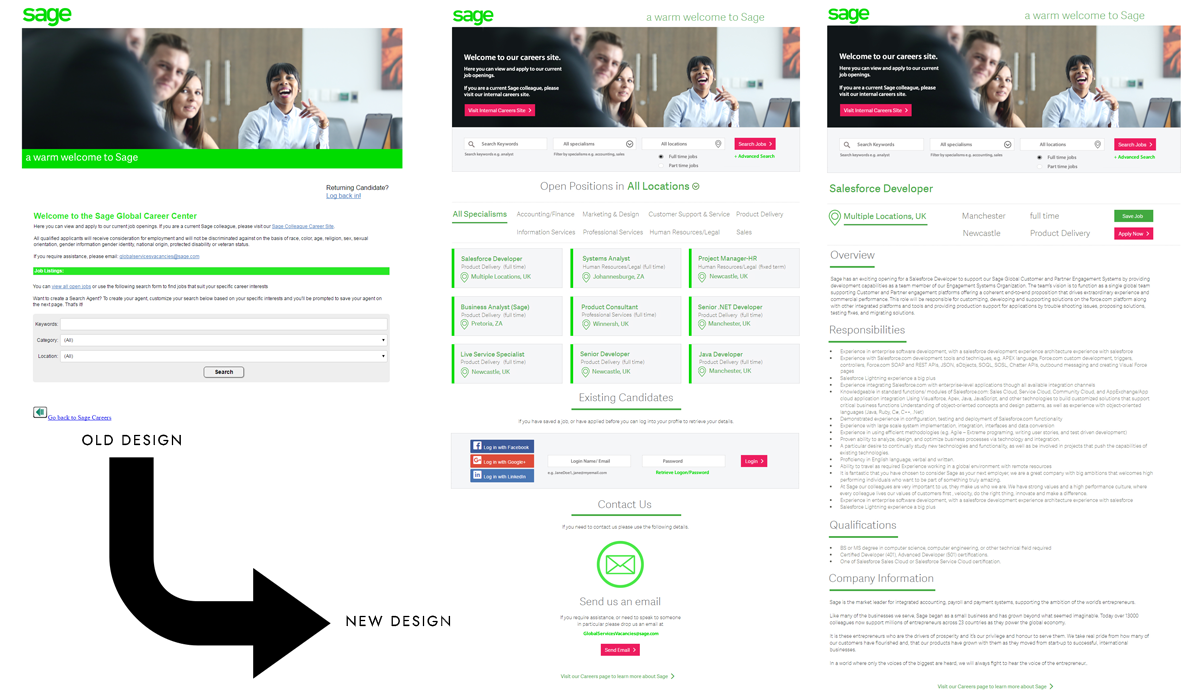
As part of an interview at Sage I was tasked with improving the usability of their careers website. The original website had layout and usability issues, it had a segmented brand identity and there were inconsistent navigation issues making it difficult to search through the open positions and amend search criteria to widen the scope of results.
Research
I began with performing a competitor analysis on other careers and job search sites to gauge what the current trends were, and what best practices were used. Next I sat down and brainstormed the scenarios and tasks that a jobseeker would be performing on this site and what features may be useful. Location, position and categorisation were all key themes in competitor sites and useful criteria that a jobseeker could use to narrow or widen their search criteria. Being able to compare similarly titled jobs at a glance was another useful feature, and if salaries were advertised the jobseeker could at a glance compare what additional responsibilities were required at higher level positions.
Design
Initial paper based sketches were created for initial design concepts based on the tasks a jobseeker would wish to accomplish and how the interface would facilitate these options. Once I was confident that all the necessary features were covered for this journey I then mocked up a high fidelity clickable prototype in Axure to present the visual branding refresh as well as to indicate areas where new features had been introduced, such as location filtering and dynamic card refreshes based on the jobseeker's search criteria.
The existing candidate login experience was hidden away in a link and required the jobseeker to use a dedicated account that was created for this particular website. With the feature of single sign on via social media logins becoming increasingly popular and a well known trusted method of setting up an account, this was a feature I felt was necessary to include, especially if a jobseeker could use their existing LinkedIn account to sign into this careers site. Another important feature that I included in this design was to have the ability to search and filter available at the top of each page, regardless of whether the jobseek was at a search results level, or a job description level so that they had the ability to quickly search for other opportunities without having to navigate to a centralised location in order to perform this action.
Validation
I validated my designs by asking a small group of people to interact with the clickable prototype and for me to observe their interactions and to ask for any additional features that they believed were missing. I also made a note of any areas that could be fed back as improvements. In a normal project setting I would widen the scope of testing and do multiple rounds of validation to ensure the product met user needs.
View Sage Careers Prototype in InVisionThe Last Dance
Music Website Redesign
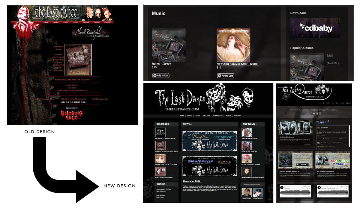
The Last Dance are a Californian based alternative rock band who wanted to update their website to reflect their latest album release. Their current site was themed around a previous album release, and suffered an outdated design, text contrast issues, and it did not include any links to social media. Their challenge was that they wanted a fresh new design which was inclusive of social media plugins and a hub for their fans to find the various ways of getting in touch with the band but also to direct them to the digital resources where they could download their music.
Research
I researched a variety of music and band websites to see what the current trends were for this genre of website. After extensive competitor analysis it was clear that social media integration was key to promote the latest tours, shows and releases, and this could also be used to cross promote the update of the website itself. The current website also lacked links to where their music could be digitally downloaded, and only focused on physical CD sales and with the popularity of physical media becoming out of fashion it was essential that the website included links to digital formats. I sat down and brainstormed with the band the key digital download sites that their fans would use to download their music and which of these they would want embedded into their site.
Design
The band sent over some of their existing visual design assets and a copy of their latest album so I could see their visual identity and get a feel for how their site should be themed. Their latest album artwork featured a dark colour palette featuring primarily dark greys and black, and their updated logo featured white skulls on a black background. I created visual designs which complimented these concepts and to illustrate how the layout could be amended so that the social media integration was a key element. Once I was confident that all the necessary features were met I then created a HTML website which included the social media feeds and embedded graphic banners to link off to their social media pages and digital download sites. I also embedded a music player into their site so fans could listen to tracks on their website rather than having to be diverted away from their official page.
Validation
The website was delivered in code so that the social media integrations could be tested as soon as possible, and the band had tight deadlines to meet. The band received positive feedback from their fans on their new updated website, and they used it as part of promoting their European tour and to post dates and locations to inform their fans of their latest shows. The site also provided a central location where fans could find both physical and digital releases of their music, and they also used it as a way of directly contacting the band for out of stock items.