
Project information
- Category: Branding & visual design
- Clients: Alt Labs, Teesside University & various small businesses
- Summary: A variety of visual branding and identity work.
Alt Labs
Branding Project
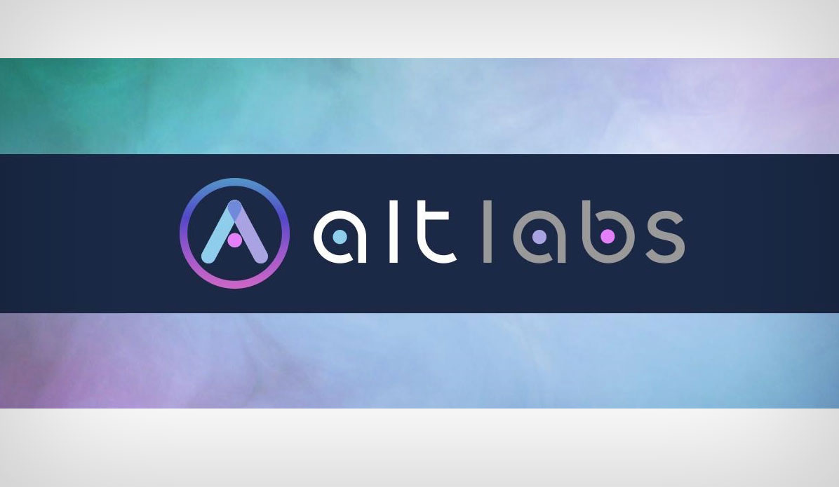
Alt Labs is a North East UK innovation agency that runs design sprints and accelerator programmes for start ups in collaboration with large businesses. Their main partner is Transport for Wales Rail who they work with closely to source promising start up ideas which could help innovate the rail industry through Lab by Transport for Wales. I worked closely with Alt Labs to refresh their previous logo which did not fully reflect their mission and purpose as an innovation agency, and did not incorporate the three main themes they wanted to use in their strapline - Innovation, Creation and Ideation.
Their previous logo featured strong type text and a science beaker which had three bubbles floating out of it. To carry over an initial concept of their previous logo into the new refreshed concept I decided to keep the three bubbles and have each bubble represent one of their three main themes. I chose a colour pallete which was fresh and modern to reflect the purpose of the company, and I used three primary colours which would co-ordinate with their three core themes. An animated version of their refreshed logo was also provided, where the A icon would begin as the three dots and would then morph into the three concepts of the A to form the letter. This graphic would be ideal for any presentations, or loading screens and was intended for multiple purposes.
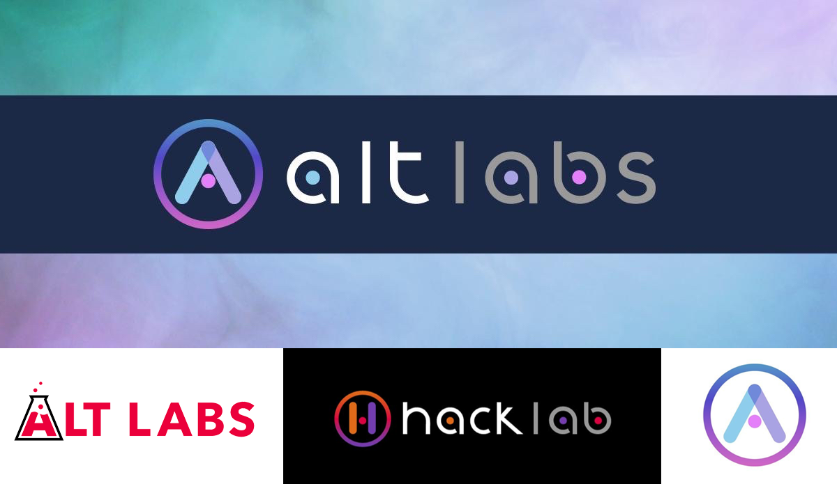
As part of their branding requirements, they also wanted a similar identity creating for their innovation events project Hack Lab. This identity needed to be part of the Alt Labs family, but also have its own distinct colour palette. Warmer tones were chosen for this branding to compliment the cool tones used in the Alt Labs palette. Both of these identities shared the same custom font which I created using Font Forge named Alt Font. This font set contained all required alphanumeric symbols as well as special character sets.
Joyce Digital
Logo Design
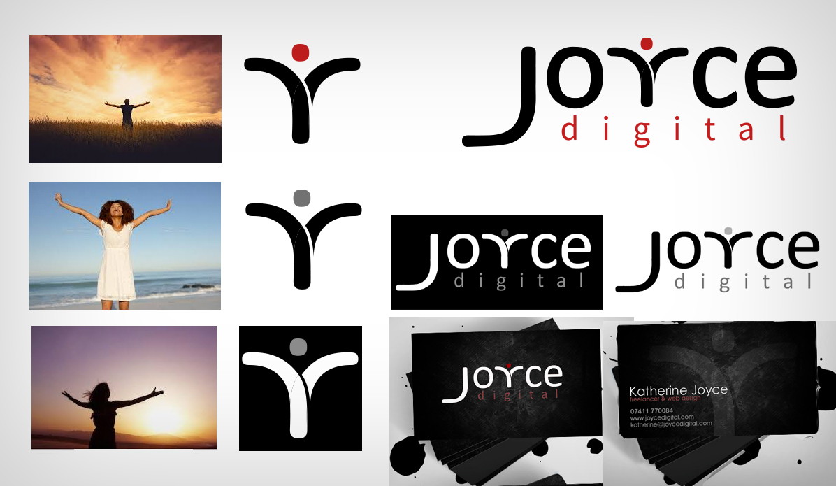
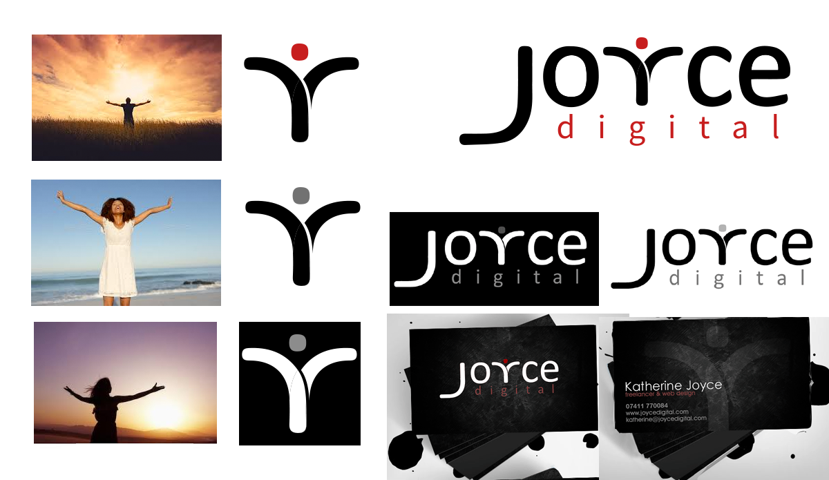
When I first started freelancing and conducting contract work in the UX/UI design field I wanted an online web prescence that strongly linked with my personal identity and portfolio. I came up with the concept of a logo for Joyce Digital which is the name of my personal brand.
I sketched a few initial design concepts, wanting a strong brandmark version of the logo which tied in nicely with the main wordmark - especially for use on business cards and on mobile. I liked the idea of Joyce being linked with the concept of joy and making designs that make people happy, so I wanted to create a logo for my brand that expressed a sense of joy somehow. I sketched a few initial ideas playing around with the idea of having a smile embedded somewhere, but did not want to be associated with the Amazon identity, so I took a different approach - rather than focus on a smile, I wanted to focus on the other expression of joy - someone with their arms outstrtched in happiness or relief.
I started to create my own font for the logo, using vectors to splice up some of the characters and reform them as others - the 'J' and the 'Y' letterings were made by slicing sections away from the 'C' and 'E' characters, and in doing so I created a 'J' which resembles a person with their arms outstreched, which was finished off by adding a dot for a head. This created a strong character which looked fitting as part of the full wordmark, but could be used in isolation as a brandmark.
Teesside University
Gift Finder App
Teesside University wanted some designs and an initial proof of concept prototype for a gifting app designed to showcase how mobile technology could be used to help improve the gifting experience. I came up with a logo design concept that illustrated someone trying to target the perfect gift through a reticle - similar to sniper trying to lock onto their target.
The colour palette for the app was primarily blue and grey so I came up with a few variations of colour schemes for the logo which would compliment this.
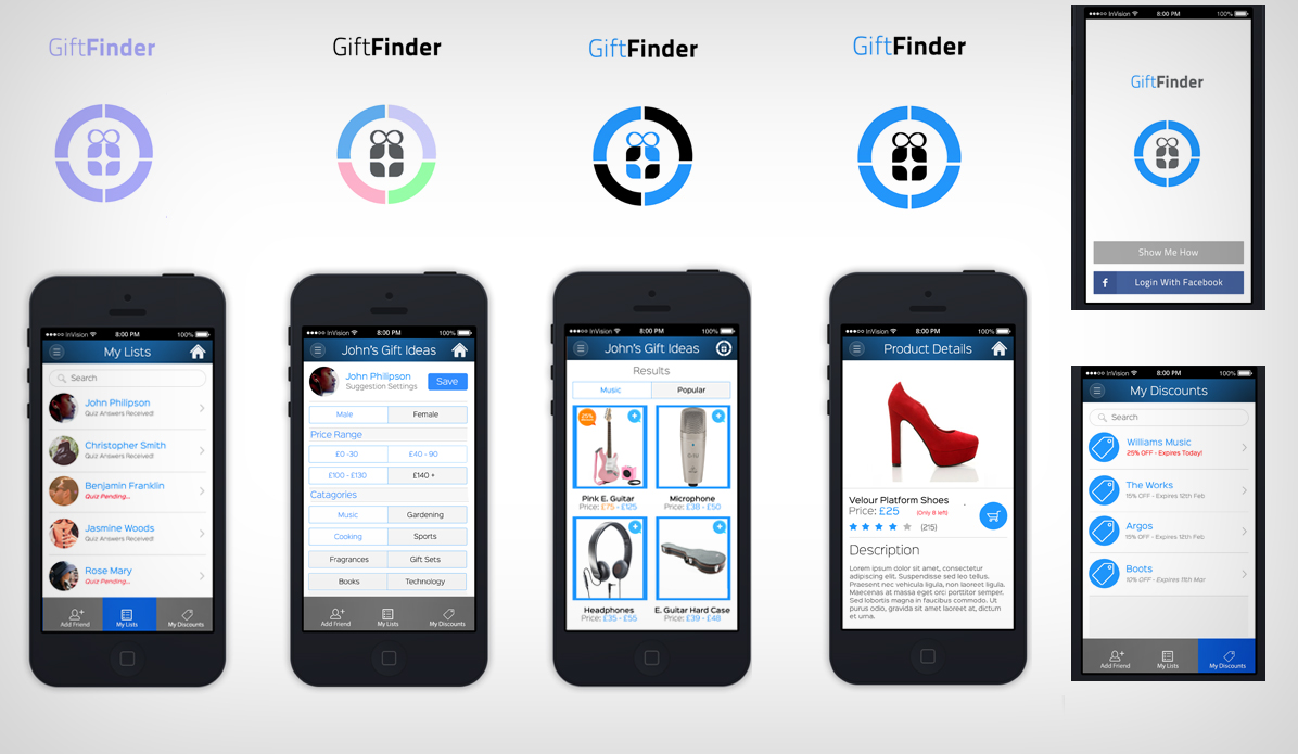
The concept for the app was to help people buy gifts for friends and family through sending out a quiz using the app to retrieve initial ideas for things the gift receipient would be happy to receive for all occasions. The app would then give the user the option to set parameters for their gift search, such as price ranges, categories, and themes and the app would also provide discounts to the user when close to the proximity of their retail stores as a method of persuasion to purchase at their location rather than elsewhere.
View Gift Finder App Prototype in InVisionCosy Warm Creations
Logo Design
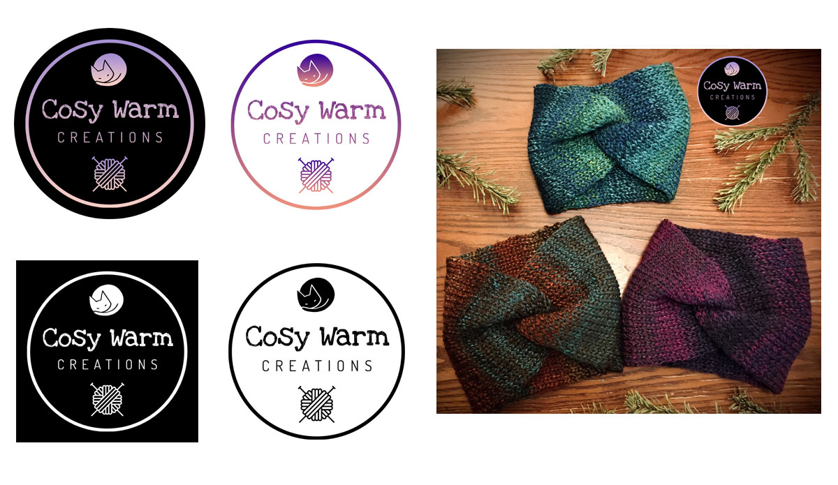
Cosy Warm Creations is an online retailer of handmade knitted items. Their items are promoted via social media platforms Facebook and Instagram and a logo needed to be designed so that this could be used as the main profile picture and as a watermark stamp where necessary on product pictures.
The concept for the logo was to combine the theme of handmade items having a 'stamp of approval' due to them being high quality, the link between yarn products being cosy and keeping you warm, and the yarn used in the products being sold. The final logo combined each of these themes to provide a circular stamp shaped logo which can be added to both social media and photography. The font choices used were more handwritten and personal compared to big corporate logos which often have precise and bold lettering.
Velveteen Dreads
Logo Design
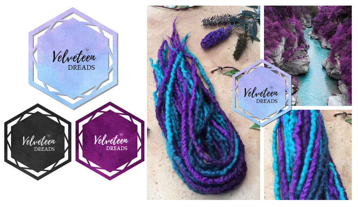
Velveteen Dreads is an online retailer of handmade luxury hair extensions. Their items are promoted via social media platforms Facebook, Instagram and Etsy. A logo was required so that this could be used as the main profile picture and as a watermark stamp where necessary on product pictures. The logo would also be used on sales invoices and on printed labels.
The logo which was designed combined geometric shapes with a subtle colour gradient of purple to blue as one of the most popular selling hair extension sets was a purple and blue colour scheme, however it was also designed in monochrome for printing purposes as well as in a solid colour so it can be used as a watermark at lower opacities for photographs.