Project information
- Category: UX review, user research & app redesign
- Client: Teesside University
- Summary: Review of iPhone app and redesign to improve user experience.
Teesside University
TU iPhone App
Teesside University had an existing student app for iPhone which could be downloaded by all enrolled students at the university. The problem was that the university was not getting a high level of student engagement with the app, and they wanted to investigate why this was. I explored this problem from all angles - performing an expert UX review on the app itself, performing user research with students at the university to understand what their thoughts on the current app were, performing desk research on existing mobile app designs and common features and I put together a report documenting the findings and proposing a new design and new features for the app to increase student engagement.
UX Process
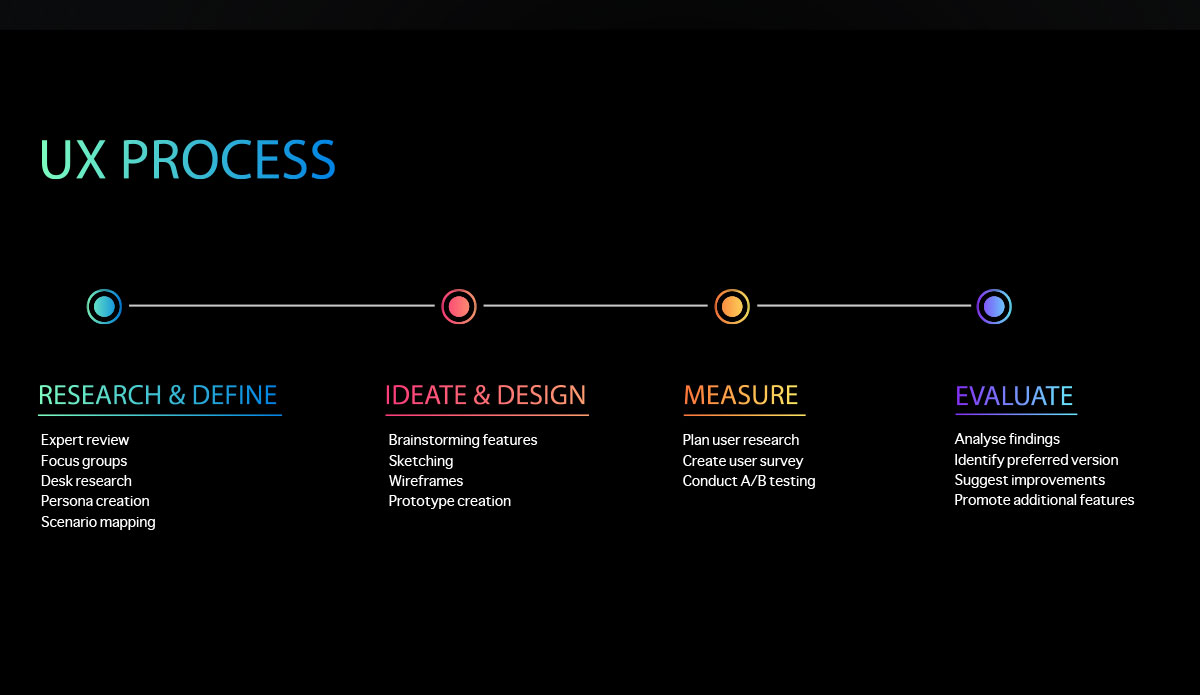
Research and Define
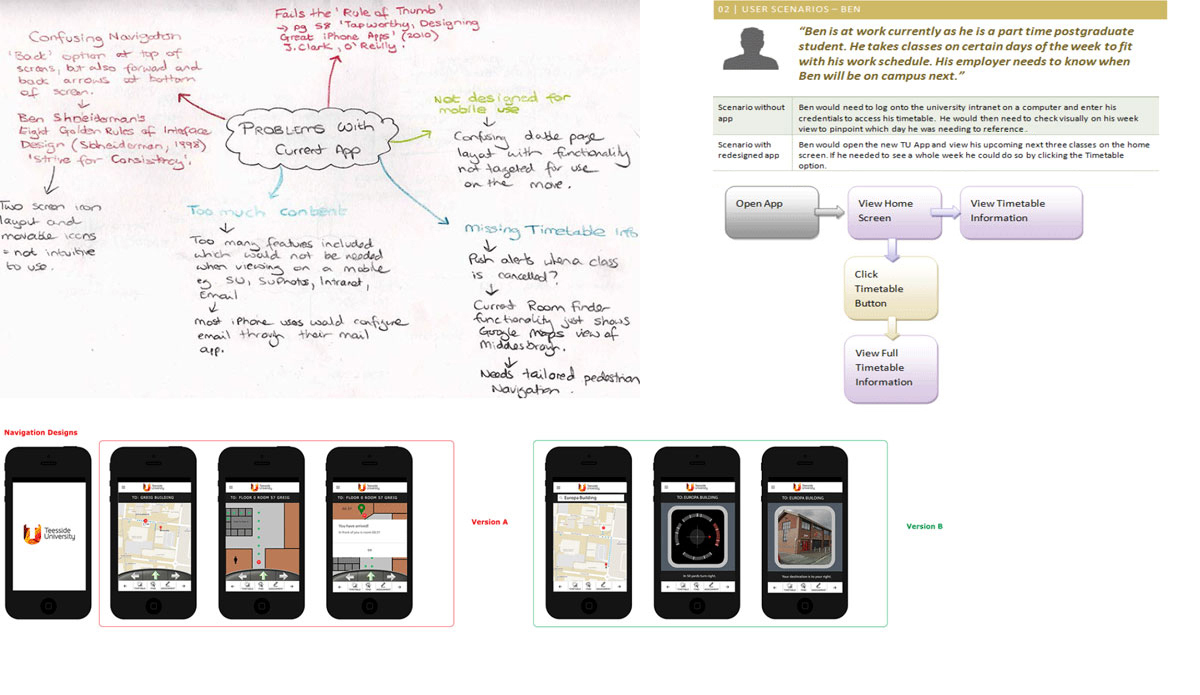
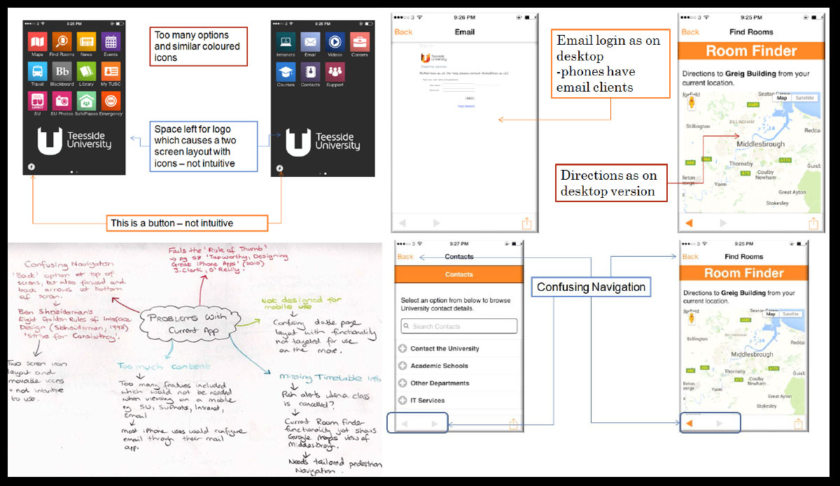
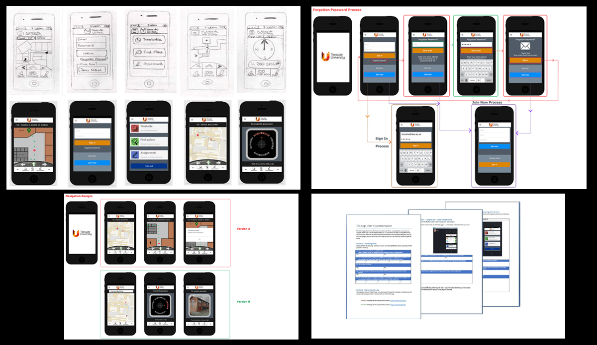
An expert review was performed on the existing app, and it highlighted some key areas of concern - the main issue being that the app had not been designed as a mobile app, rather it felt like a collection of shortcuts leading to other areas of the university website ecosystem. The navigation was confusing to a user, the design prioritised the majority of the content at the top of the screen outside the easy reach of a user's thumb, there was an overwhelming amount of content, rather than a selection of relevant features and heaviour, and the app generally felt like it had not been designed for mobile use, rather the existing desktop features had been attempted to be ported down to a smaller mobile screen. I performed some research in a focus group setting with students to understand what their user needs were for a mobile app, and what would be features that they would want to use on a daily basis. The aim of this approach was to introduce a smaller set of features as an initial MVP and for the university to then expand functionality incrementally, instead of expecting the students to navigate through a large quantity of options. The key features requested by students were the ability to have directions or navigations to classes on campus, the ability to view timetable information, a list or record of their assignments, and an overview or map of the campus layout.
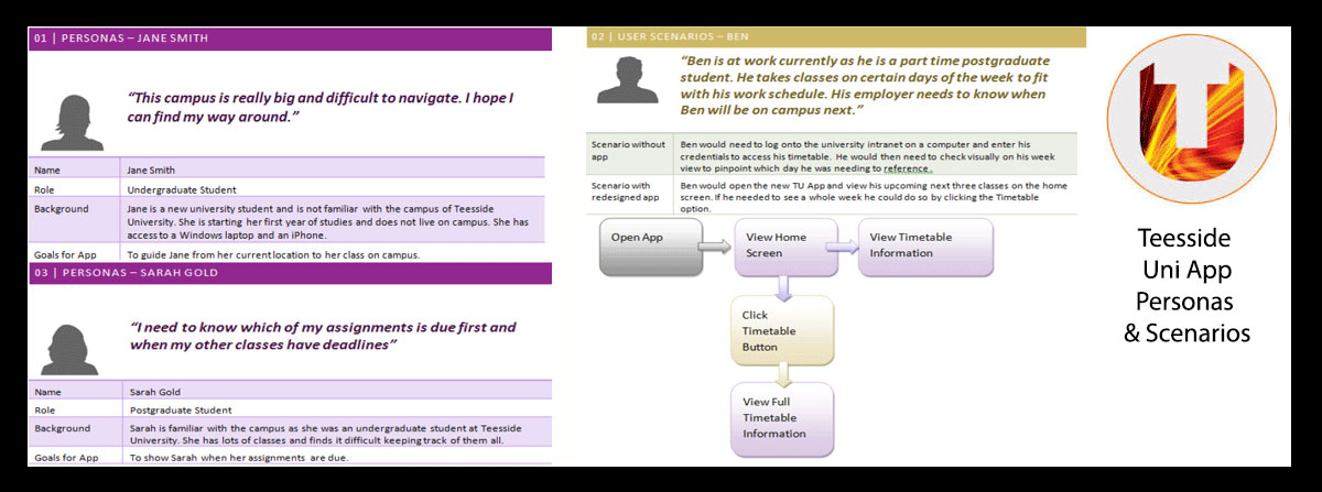
Personas and Scenarios were mapped out at a high level to understand the user needs and to keep these in mind when coming up with designs for the newly proposed features.
Ideate and Design
I wanted to provide two options to the students in regards to the navigational guidance element of this design for guiding them on campus to their requested location, so I sketched out and constructed two InVision prototype versions to showcase both ways of implementing the navigational interface elements of the design. Version A of the design allowed a student to always view the map and their location on it whilst being navigated by arrows at the bottom of the screen, however version B explored a compass navigation which gave step by step instructions as to which direction to walk in, rather than being referenced by the map view.
You can view the InVision prototypes used for the user research at the below links.
View TU App Prototype in InVision (Version A) View TU App Prototype in InVision (Version B)Measure
A/B testing was performed using a sample size of 8 students to understand how each design performed, and to understand which of the two designs worked better for students. A questionnaire was constructed to ask each participant to perform certain tasks using the prototype and to record their comments along the way of what they thought of each feature and it's ease of use. I observed the participants' progress as a group, and I also spent time individually after the sessions to understand their feedback. The results of this test was that students preferred to have the visualisation and their location referenced on the map view at all times so they could see how much distance was left between their current location and their intented target. The students also made some additional suggestions of how these proposed features could be improved further with some slight tweaks or additional options.
Evaluate
The findings of the sessions were collated into a report, and the recommendation to the unversity was to create a scaled down version of an iPhone app focusing on the key features explored, and further rounds of usability testing and user research would be vital in understanding and validating user needs to deliver an app which students would use on regular basis.
View TU App Report