Project information
- Category: User Research, Product Design, Journey Mapping, Leadership & Strategy
- Clients: Capita
- Summary: Creating a Salesforce driven product to improve grant applications.
Capita
Grantis Grant Disbursement
I've been involved in helping craft Capita's grant managment product from it's initial PoC all the way through to multiple bid responses and two client implementations working with central government departments. Grantis is a Salesforce platform product which has a GDS themed front end following best practice design patterns and adhering to accessibility standards, and a Saleforce custom back end interface which can be used for grant administration and reporting and dashboards. The combination of both provides a positive application experience with the ability of filtering applicants through an initial eligibility checker service and status updates within a customer portal after submission, and from a processing perspecive allows a customisable review back office process where automation can be used to reduce the amount of manual processing required to make a decision on a grant application. I became initially involved in this project as one of the founding members of the Digital Product team in the specialism of UX and later grew the team to ensure we had experts in the fields of User Research, Content Design and UX Design to ensure our client implementations followed service design standards and user centric design principles. We are continuously improving our product offering and iterating on further product features.
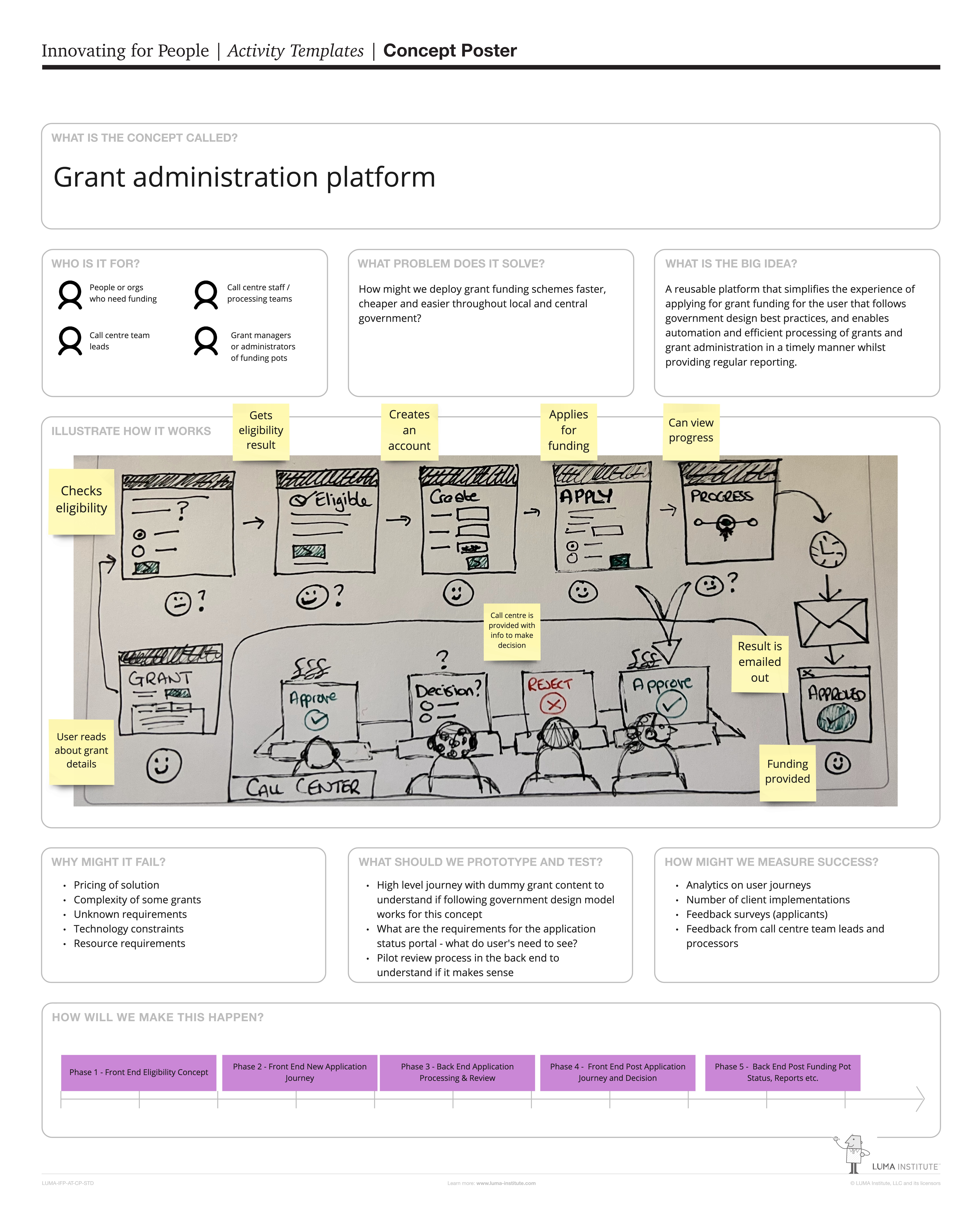
Concept poster for Grantis
The initial concept for Grantis was to enable funding schemes within government to be faster, cheaper and easier, and to introduce automation into parts of the review process.
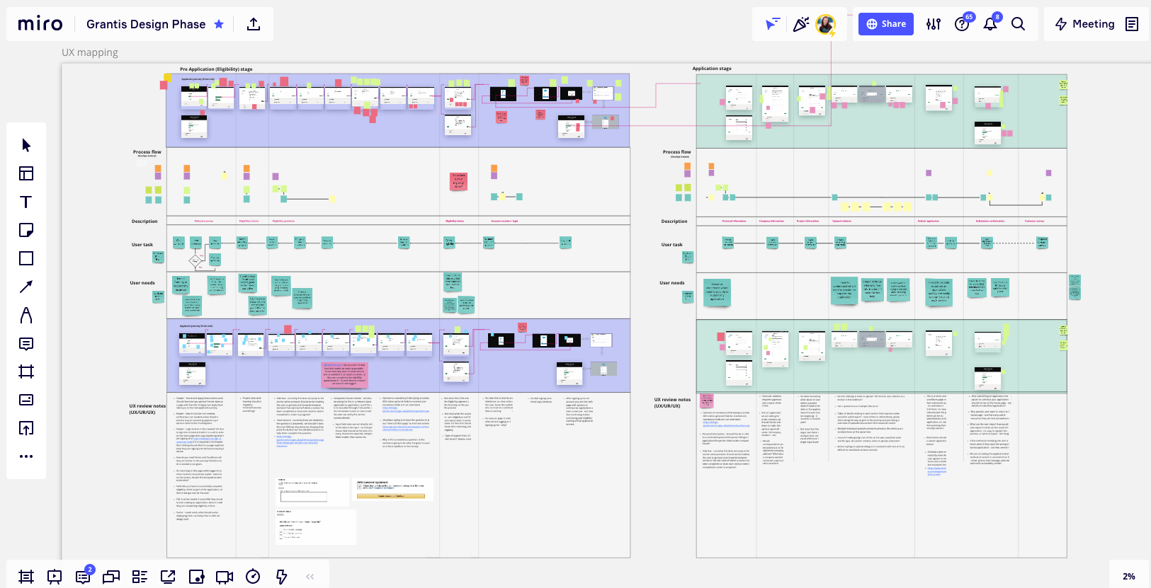
Mapping out the journey
Part of my initial work on Grantis was to map out the MVP product as it evolved from the initial PoC. UX recommendations based on the review of the initial PoC fed into the requirements to improve the product to design the version which would become the MVP. This diagram shows how screens were mapped alongside process flows provided by the Business Analyst team, which the UX team turned into tasks a user would need to perform, and user needs and UX improvements were also documented.
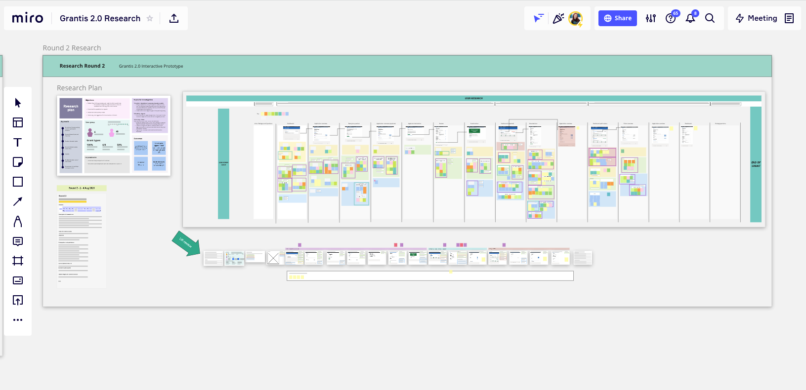
Iterative design
Multiple research rounds were performed on the built version of the product and on interactive Axure prototypes of proposed design features to add to the product to gauge customer engagement and usability. We mapped out high level research plans prior to each session, worked on understanding what needed to be validated and then we worked on writing discussion guides. The findings after data analysis were mapped onto Miro boards against the screen flows and insights were identified and played back to the team.
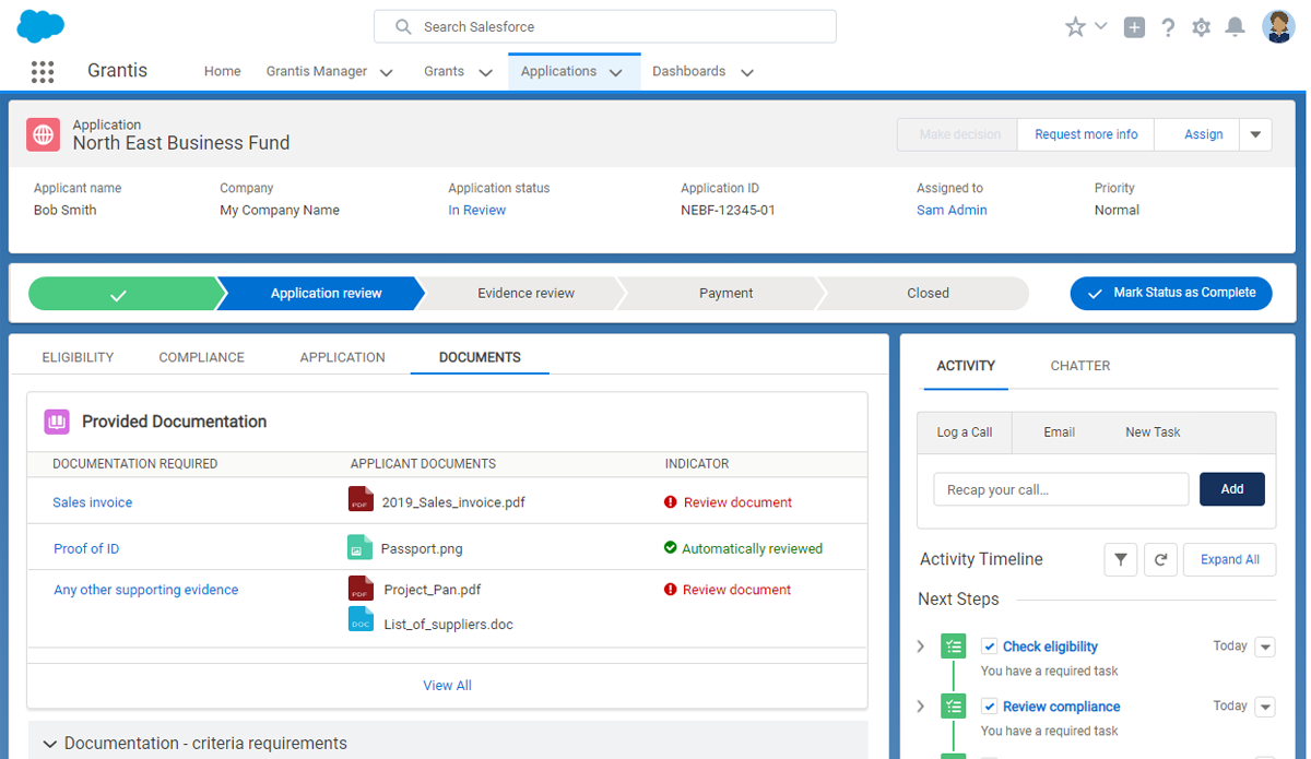
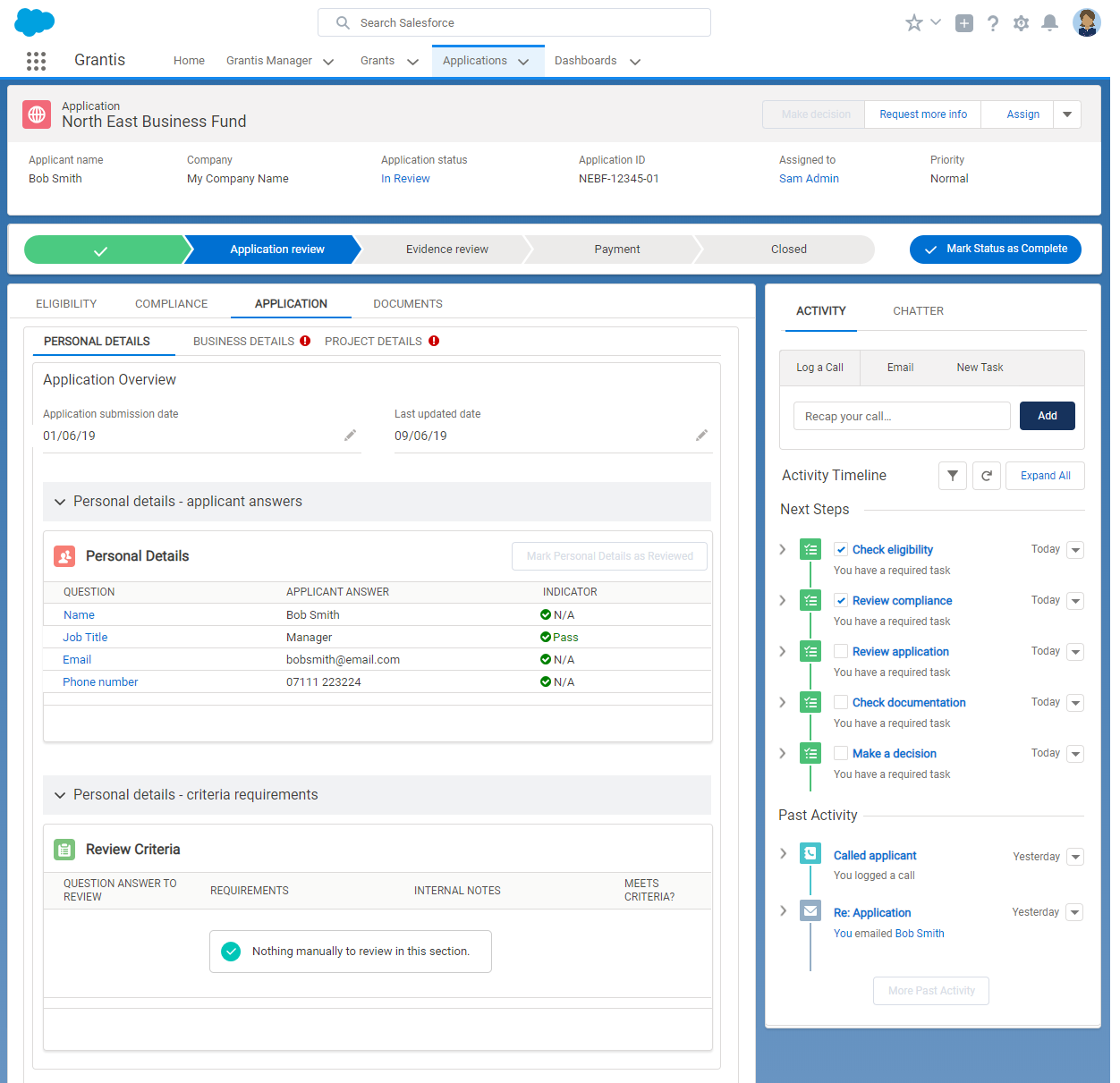
Back end processing
Axure prototype testing was performed to understand exactly what functionality was required from admins to process grants and what information was a priorty to make these decisions. A customised work area was created with a task list guiding an admin through the process of reviewing a grant application.
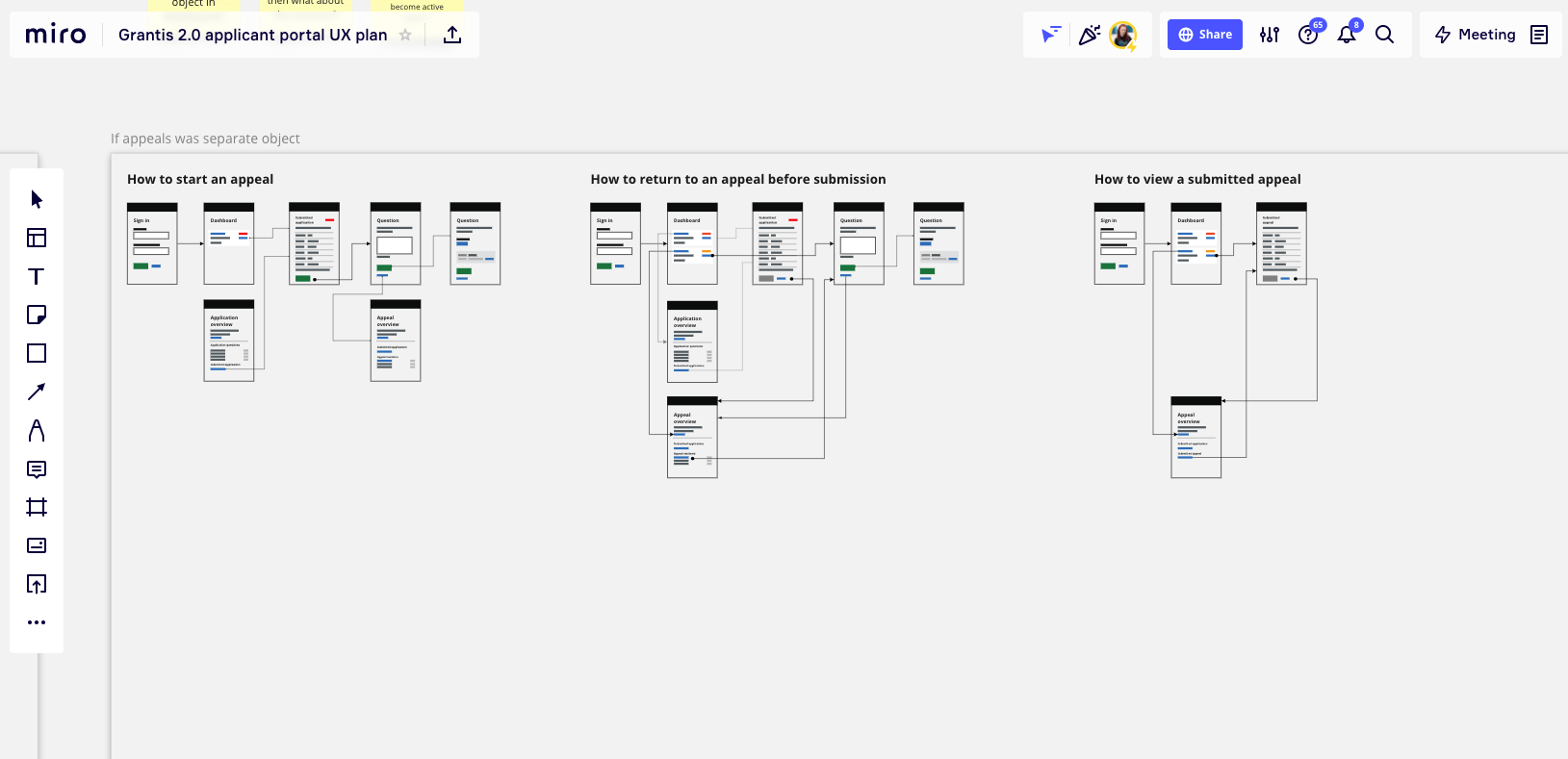
Application task flow mapping
Task flows to map out the journeys for each step in the application journey were created so that a high level view of the intended functionality could be used in discussions with development teams to validate whether certain features were technically feasible before crafting detailed wireframes based on content from our content team and actual application questions.
Outcomes
Grantis has gone through two product versions based on technology and design pattern improvements and is constantly adding features to improve the grant management and application experiences. Our two client implementations were successes, processing high volumes of grant applications and automating a large portion of the decision making process.