Project information
- Category: Style Guide Creation, Journey Mapping
- Clients: Accenture
- Summary: Creating style guides for consistent analytics dashboards for RPA.
Accenture
Style Guide Creation
While working at Accenture I was contracted out on a project for a central government client to help create and design customised analytics dashboards to report on the performance and usage statistics for some of the newly introduced Robotic Process Automation (RPA) processes which were introduced to streamline some paperwork based processes that were being digitised and processed by automation.
Understanding the Users
Before any design work or engagement with the development team was carried out I spent some time engaging with the BA team to understand who the users and stakeholders of these dashboard views would be, and what tasks they would be using the data retrieved for. This enabled a design plan noting down tasks a user of each role would need to perform on the dashboard, and what data would be useful for them to view to achieve these goals. Content and language of the labels was very important during this project, as given the nature of the dashboard interface character limits before trunctation was common, and the information on the screen needed to convey the meaning of the data in the most clear and concise way.
Understanding the Technology
The first step in creating these dashboard designs was to speak to the data analytics and development team and to understand what technology was going to be used to implement the dashboard interfaces. The chosen software for this task was Qlik Sense Analytics and the development team then spent some time explaining what data points would be available to track data throughout the automated processes. Once I understood what kinds of data we could capture, we then mapped out business process flows, highlighting the areas along the process where it would be beneficial to stakeholders to capture certain data points relevant to the tasks they would be performing or reviewing on the dashboards.
Creating the Style Guide
As the development team were pulling in various datapoints into the Qlick Sense Analytics dashboards, we were constrained with what UI options we had available to customise the interface. Based on this knowledge I proceeded to create a design Style Guide which listed which colours should be used to ensure accessibility criteria were met, guidance on what type of data visualisation was appropriate to use depending on the data driving it, and examples of how the dashboards should be styled and where labels should be placed.
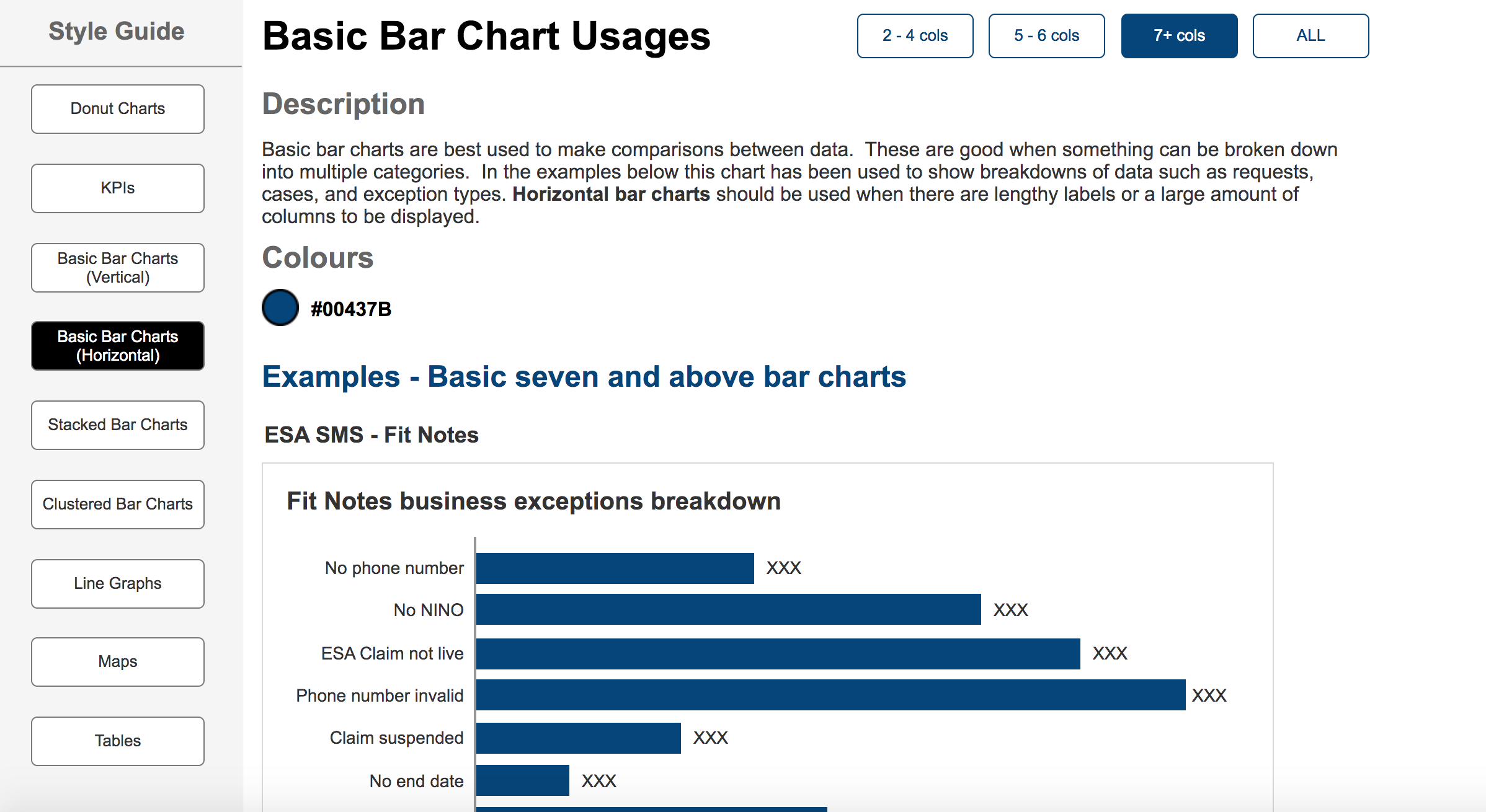
Bar chart visualisation guidance
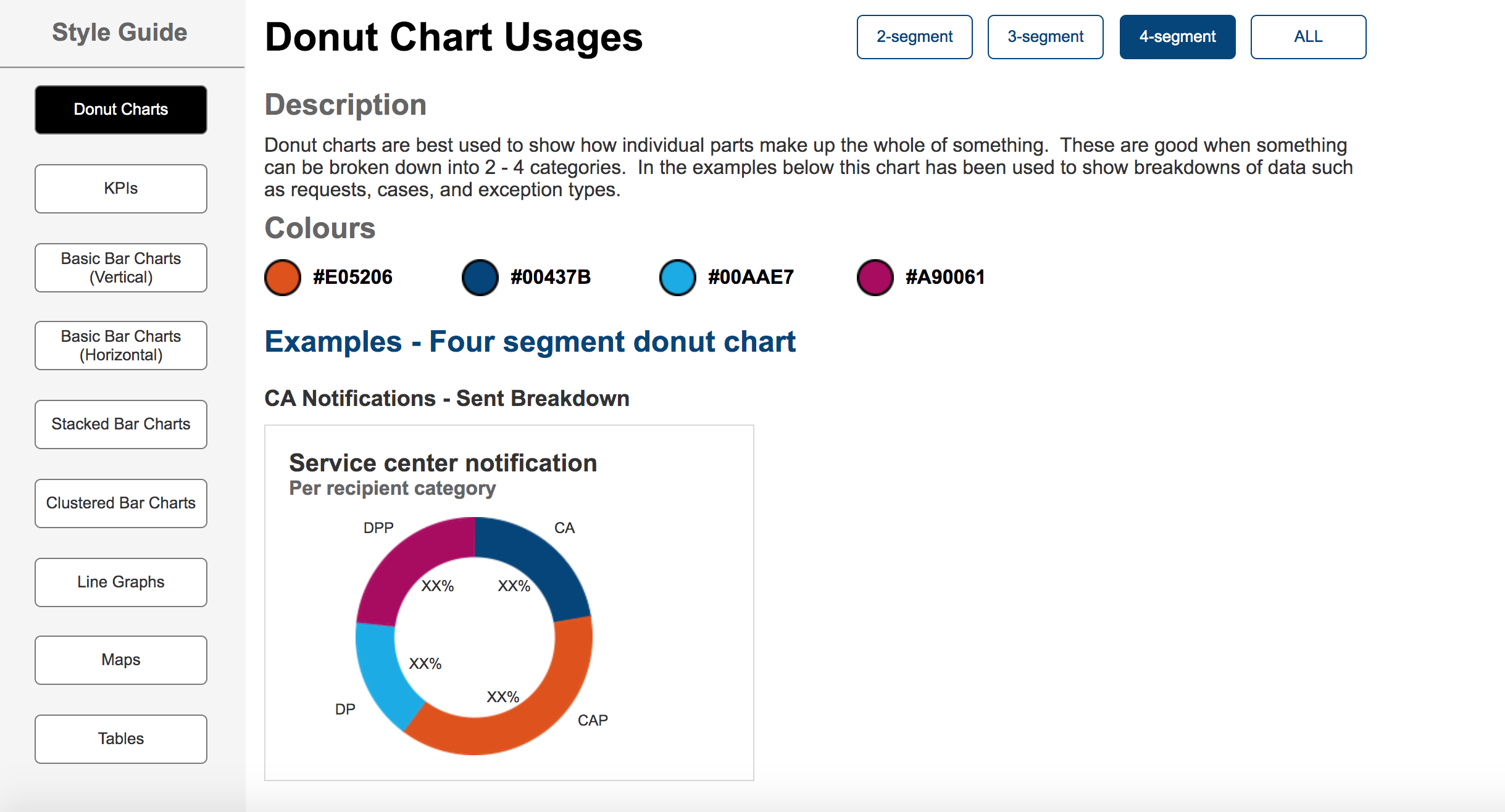
Donut chart visualisation guidance
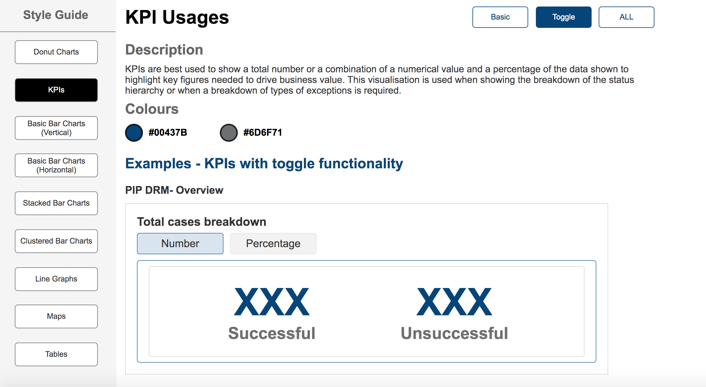
KPI visualisation guidance
Validation
The dashboard designs were mocked up in Axure and presented back to the key stakeholders in regular show and tell sessions, and feedback on the dashboard data and revisions to include further data points, or to remove less relevant charts was iterated on throughout the sprints. Once final dashboard designs were signed off by the stakeholders, these were used by the development team to implement on the live service using the real live data, and a UX review was performed to ensure the implementation matched the designs appropriately.
Feedback from the stakeholders throughout this validation process was that this way of visualising the data of the performance and statistics of the automated processes would easily highlight areas for improvement, and to identify and reduce bottlenecks in the overall process performance. After the dashboards went live after 2 months of collecting data these insights could already be factored into their continuous improvements process to help improve the end to end user experience of processing a lot of digitised forms quicker and more efficiently.